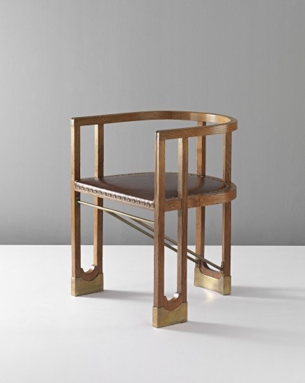
#Wiener Werkstatte
Explore tagged Tumblr posts
Visit Tumblr Blog
Explore Tumblr blogs with no restrictions, modern design and the best experience.
Last Seen Tumblr Blogs


Fun Fact
The most popular pages on Tumblr are about Minecraft, GIFs, and David J. Peterson.
Text


Josef Hoffmann
Sous le charme de la beauté
Adrián Prieto, Christian Witt-Dörring
Hannibal, Veurne 2023, 208 pages, Hardcover,24,5x28cm, French Edition, ISBN 978 94 6466 668 7
euro 60,00
email if you want to buy [email protected]
Innovative introduction to the iconic work of architect and designer Josef Hoffmann
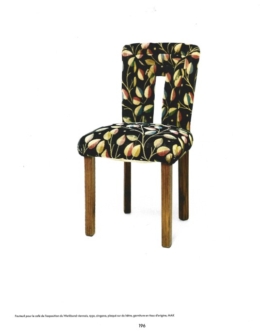
The Viennese architect and 'all-round designer' Josef Hoffmann (1870–1956) is so much more than the founder of the Wiener Werkstätte. This book offers a broad view of his oeuvre that developed over no less than sixty years. The timeless beauty of Hoffmann's creations shows not only his importance as a historical figure, but also as a source of inspiration for several generations.
Richly illustrated with furniture, objects, designs, textiles, photographs, drawings and documents. Special attention is paid to his creative working method and his misunderstood use of color.
This monograph is published on the occasion of the exhibition Josef Hoffmann – Under the spell of beauty, which will take place from October 6, 2023 to April 14, 2024 in the Brussels Museum of Art & History. The project was created in collaboration with the Museum für angewandte Kunst (MAK) in Vienna and is one of the eye-catchers of the Art Nouveau Year 2023 in Brussels.
13/11/23
#Josef Hoffmann#architect and designer#Brussels Museum of Art 2024#viennese architect#Wiener Werkstatte#furnitures#textiles#objects#drawings#designbooksmilano#fashionbooksmilano
23 notes
·
View notes
Text


Gudrun Baudisch (1907-1982) appreciation thread
#sculpture#clay#ceramics#ceramic sculpture#wiener werkstatte#female sculptor#female artist#europe#austria#gudrun baudisch#ceramicist#art history
4 notes
·
View notes
Text
Dagobert Peche: Master of Ornament from the Arts and Crafts Movement to Art Deco
“Dagobert Peche was the greatest ornamental genius Austria has produced since the Baroque.” - Josef Hoffmann
Dagobert Peche was one of the most influential designers of the Wiener Werkstätte. (1) His work falls under the Arts and Crafts Movement and was extremely influential to the burgeoning Art Deco style. A very versatile designer, “Peche has been credited with ushering in a new era for the decorative arts” (2). “Peche designed across numerous media including wallpaper, textiles, furniture, glass, jewelry, toys, and metalwork” (1) and is also renown for his graphic designs. (1)
Dagobert Peche was “born April 3, 1887 in Lungau, Austria” (2). As a boy he aspired to become a painter, but his older brother was a painter so young Dagobert decided to become an architect. (3) Peche began his studies in engineering and architecture at “Technische Hochschule (Technical College) in Vienna” (4) in 1906. He studied under Max von Ferstel, Karl König, and Leopold Simony. (2) Two years later Peche left Technische Hochschule to enroll in “Akademie der bildenden Künste in Vienna (Academy of Fine Arts), where the architect Friedrich Ohmann was his main influence” (2).
In 1910 Peche journeyed to Great Britain where he was influenced by the art and design he saw there; Aubrey Beardsley’s work may have had a profound influence on the young designer. In 1911 Peche graduated from the Academy of Fine Arts and also married his love Petronella (Nelly) Daberkow whom he had met the previous year. (2)

Dagobert Peche, Brooch (C. 1917) Image source.
Another momentous encounter in Peche’s life happened when he met architect and designer Josef Hoffmann at a celebration held in honor of architect Otto Wagner’s 70th birthday. (3) Hoffmann began buying Peche’s textile and wallpaper designs for the Wiener Werkstätte. During this time Peche brached out in other areas of design “contributing designs for furniture, glass, jewelry, and toys” (2). His graphic designs for “postcards…invitation cards, bookplates, and posters” were popular as well. Many of his designs featured “a touch of the [Baroque and] Rococo style, and carry a playful erotic charge. Peche also designed woodcuts, which were included in the fashion portfolio Mode Wien 1914/15” (2).
Peche officially joined Wiener Werkstätte in 1915, “eventually becoming co-director between 1917 and 1923” (4). He also served as “Zurich branch of the Wiener Werkstätte until 1919” (1). “Peche “was drafted to serve in the war in 1916, but was released in 1917 after suffering from appendicitis” (2).

Dagobert Peche, Poster for Wiener Werkstätte fashions (1919) Image source.
During World War I, material shortages forced Peche to experiment with “simple materials like tole and cardboard” (4). A design strategy that would become more common during and after the Second World War for designers like Jean Prouvé and Jens Risom.
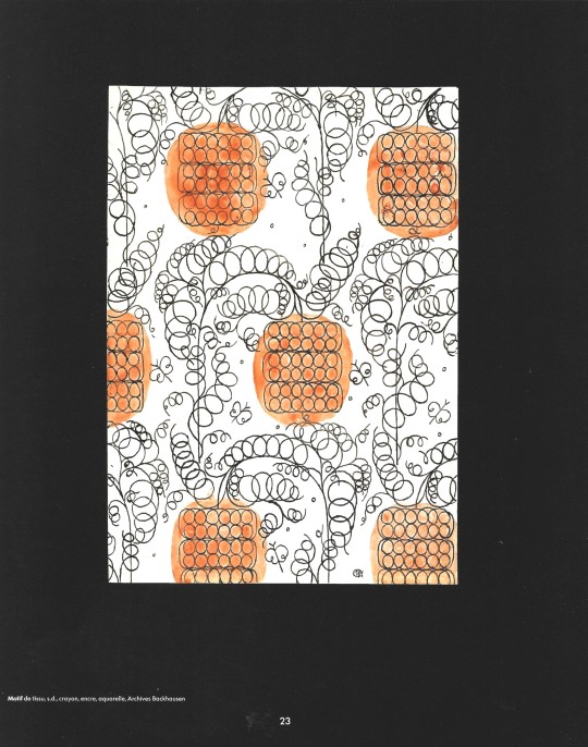
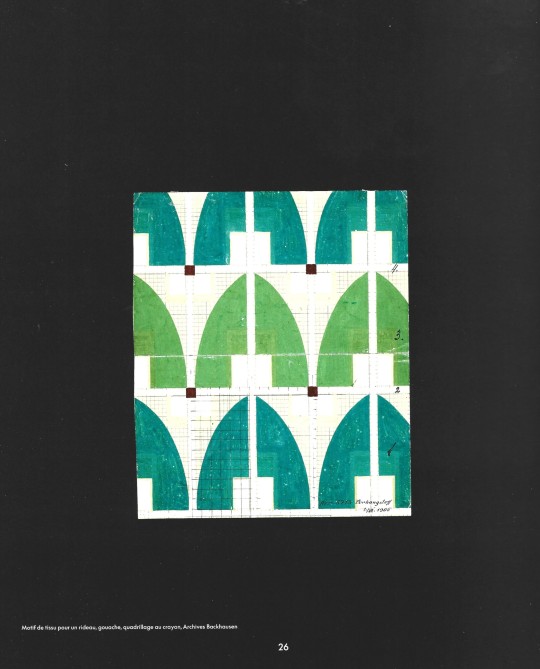
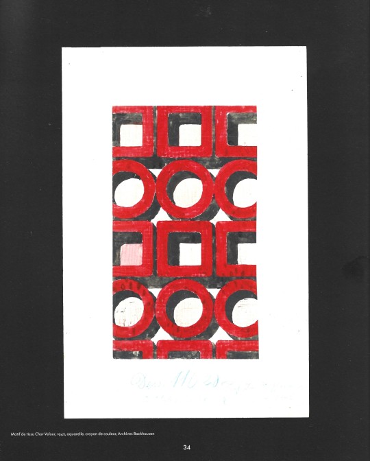
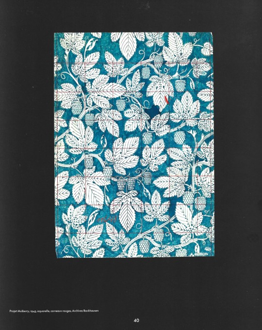
Peche did not design exclusively for Wiener Werkstätte. He also developed “textiles and carpets for Johann Backhausen, & Söhne, ceramics for Vereinigte Wiener & Gmundner Keramik, … and wallpaper for Max Schmidt and Flammersheim & Steinmann” (1).
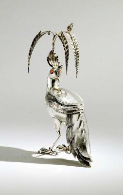
Dagobert Peche, Silver Bird-shaped Candy Box (1920). Image source.
Sadly, Peche’s brilliant career was cut short when he died of cancer in Vienna on April 16, 1923 at the age of 35. (2) While Peche’s work slightly pre-dates the Art-Deco period his geometrically stylized designs were a major influence on designers like René Lalique, Emile-Jacques Ruhlmann, and Jean Dunand.

Dagobert Peche, Large Leaves design for fabric (c. 1920). Image source.
#Dagobert Peche#industrial design#graphic design#arts and crafts movement#art deco#Wiener Werkstatte
4 notes
·
View notes

Text

Postcard of Wiener Werkstatte 'Nikolo and Krampus' by Jozef Diveky, (1887 - 1951)
607 notes
·
View notes
Text
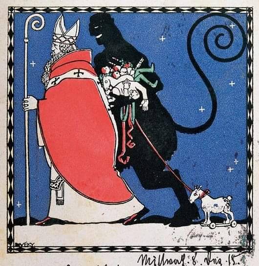
Postcard of Wiener Werkstatte
'Nikolo and Krampus' by Jozef Diveky, (1887 - 1951)
15 notes
·
View notes
Text

I don't get it. What's going on here?
Wiener Werkstatte Christmas card, Vienna, Austria, c. 1905.
4 notes
·
View notes
Text
Mela Kohler, Fashion Drawings, c. 1907

Fashion drawings, three illustrated postcards of the Wiener Werkstatte, c. 1907.
"The Wiener Werkstatte managed to mix all the manifestations of existence through artistic means. Meal tables, floral arrangements and even fashion sketches -- such as Van de Velde's -- all were integrated in one unique symmetry."
Scanned and quoted from the book "Art Nouveau" by Gabriele Fahr-Becker.
3 notes
·
View notes
Text

Niels Trannois, OEil distrait, écoute flottante 1, 2022, laser engraved plexiglas, paper, Wiener Werkstatt fabric, feather, Krone, Pine spikes from Baleares, 60x30x1cm
2 notes
·
View notes
Photo
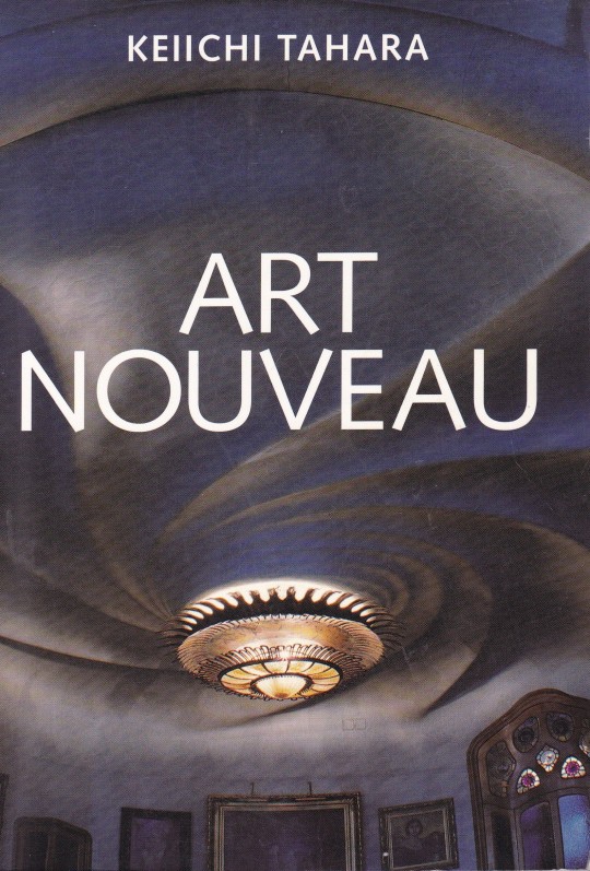
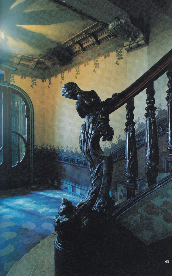


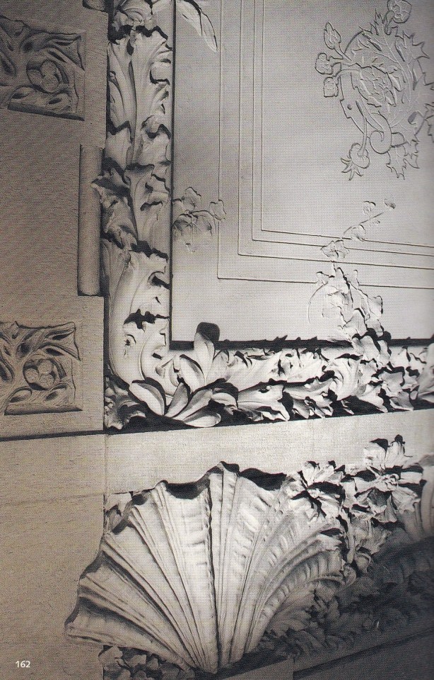


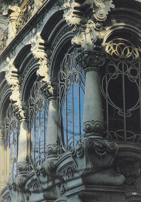

Art Nouveau
Keiichi Tahara
Philippe Thiébaut, Bruno Girveau
Editions Assouline, Paris 2000, 399 pages, 15 x 21 x 4, ISBN 978-2843231933
euro 50,00
email if you want to buy [email protected]
Au cours du dernier tiers du XIXe siècle, l'Europe connut un profond renouvellement du paysage urbain de ses capitales et du cadre de vie de ses habitants. Architectes et décorateurs étaient animés du désir de faire table rase des formules pastichant les styles historiques et de créer un environnement qui satisfasse les exigences de la vie contemporaine et les besoins de " l'homme moderne ". De cette quête de formes fonctionnelles et inédites est né l'Art nouveau. Bien que son existence ait été de brève durée (1895-1910) et bon nombre de ses créations volontairement détruites, il demeure encore des témoignages à travers l'Europe de son étonnante vitalité, de sa poursuite d'un idéal organique, qu'il s'agisse de recherches individuelles (Horta, Guimard, Gaudi) ou collectives (Ecole de Glasgow, Wiener Werkstätte). Cet ouvrage les présente, saisis par l'objectif de Keiichi Tahara, dans la diversité de leur langage plastique et formel, combinant de manière unique rationalisme et onirisme.
14/05/23
orders to: [email protected]
ordini a: [email protected]
twitter: fashionbooksmilano
instagram: fashionbooksmilano, designbooksmilano tumblr: fashionbooksmilano, designbooksmilano
#Art Nouveau#Keiichi Tahara#photography books#Otto Wagner#Victor Horta#Hector Guimard#1895.1910#Gaudi#Wiener Werkstatte#art books#fashionbooksmilano
35 notes
·
View notes

Note
About Vienna.
If you are interested in design visit the MAK which is the museum for applied arts. They have a lovely collection of secession era objects, mainly design by the group Wiener Werkstatte but they also have temporary exhibitions!
The Albertina is a great museum for modern art, and there are other museums like the Kunsthistorisches and Leopold, see what exhibitions they currently have and if there’s anything interesting for you.
There is a café called Hawelka which is a bit touristy but really lovely and it’s part of the Vienna experience in my opinion. Eating an apfelstrudel there and drinking cappucino on a dark snowy winter afternoon is the best.
A few years ago there was a café where you could still smoke inside, it’s called Kafka café and it’s an alter place, not very touristy.
And another café&bookstore I recommend is called Phil. It’s cozy and they have great books.
Have a lovely time in Vienna<3
thank u so so much! <3
0 notes

Text


LIBRARY RESEARCH
Wiener Werkstatte - The cover has a really interesting typography layout. The way the letter forms are arranged and viewed based on their construction is really creative. They have worked with space and tightly packed the typography together in the shape of a square. They have worked with stacking and layering which gives the affect that each letter is connected as one. As well as the design inside the book, they have used only capital letters, which helps the design stand out, and be bold. The artist has used the same typography effects for the 'W' that is seen on the front cover, and inside the book which is a form of repetition.
Design Art - The 'surrealism' design in this book really stood out to me. Even though they have chosen a pretty basic sans serif typeface, the 3D effect makes it really pop out and grab a viewers attention. They have used design effects such as emboss and drop shadow to give the impression that the letters are raised off the page and at a higher level.
Jasper Jones, Michael Crichton - The typography on the front cover of this book is super fun. They have used a serif typeface, which has high stroke contrast. I notice how they have left gaps in the letters, in the skinnier parts of the letter. The design inside the book really intrigued me. Theres multiple design effects used including layering, altering the baseline and playing with the arrangement of letter forms to create shapes and express ideas. For example, the final layout has type on a bend, and type that is hanging below the baseline of the rest. They have also used the stroke effect (the outline of the letter). Theres lots of colours seen in this design. Each letter is a different colour. This is a polychromatic colour scheme.
Expressionism - The typefaces on the front cover and inside this book are really fun and creative. On the front cover 'expressionism' is all in capitals. This makes it stand out and especially for a title cover, makes it clear and bold what the book is about straight away. There is some overlapping and connecting of letter in places to add contrast. The type on the design inside the book uses a mixture of uppercase and lowercase letters. They look like they have been hand drawn as they aren't perfectly laid out. They vary in size, have different weights, heights and widths. The kerning (space between letter) isn't the same throughout each letter and some are more tightly packed that others. The artist has also used the effect of stacking, which creates a more tidy effect than if they were to just leave it scattered.
0 notes
